
A scientific figure can contain accurate data, carefully labeled components, and technically correct information—and still be difficult to understand.
This is a common challenge in scientific communication.
Researchers spend significant time collecting data, designing experiments, analyzing results, and preparing manuscripts. When it comes to presenting those findings visually, however, the goal is not simply to include as much information as possible.
A good scientific figure should help readers understand the science faster and more clearly.
Whether it is a figure in a research paper, a graphical abstract, a conference poster, a presentation, or a journal cover, effective scientific visualization requires more than scientific accuracy. It also requires thoughtful visual hierarchy, consistency, color strategy, and storytelling.
In other words:
A scientifically accurate figure is not necessarily an effective scientific figure.
So, what makes a scientific figure difficult to understand?
Here are five common issues—and how to improve them.
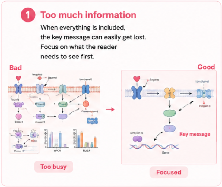
One of the most common problems in scientific figure design is trying to communicate too much information at once.
A complex research project may involve multiple experimental groups, datasets, pathways, mechanisms, molecular structures, treatment conditions, and supporting results. It is tempting to put everything into a single figure.
The result can be technically comprehensive—but visually overwhelming.
When readers encounter a figure filled with dense annotations, overlapping arrows, multiple panels, and long blocks of text, they may struggle to identify the main finding.
Before designing a scientific figure, ask:
What is the one thing the reader should understand first?
This question can help determine what information deserves visual prominence and what information can remain secondary.
For example, instead of giving equal visual weight to every experimental result, a figure might prioritize:
Research question → Key finding → Supporting evidence → Additional details
This creates a clearer reading path.
Supporting information is still important, but it does not need to compete with the main message.
An effective scientific figure often works on several levels:
Primary layer: the main scientific finding or conclusion
Secondary layer: key evidence supporting the conclusion
Tertiary layer: detailed annotations, experimental conditions, or supplementary information
This layered approach allows both specialists and non-specialists to navigate the figure according to their needs.
A reader should be able to understand the general message without studying every label.
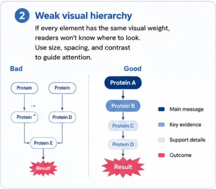
Another common problem occurs when every element in a figure looks equally important.
If all text is the same size, every arrow has the same thickness, every component has the same contrast, and every section uses equally strong colors, the reader has no obvious place to start.
This is where visual hierarchy becomes essential.
Visual hierarchy is the way design elements communicate their relative importance.
Designers can establish hierarchy through:
Size
Contrast
Position
Spacing
Typography
Color
Line weight
Shape
Repetition
For example, the main mechanism might be larger and positioned at the center, while supporting information is smaller and placed around it.
A reader should naturally perceive something like:
Main message → Key evidence → Supporting information
rather than:
Everything → Everything → Everything
Scientific figures are not just collections of objects. They are visual systems.
A well-designed figure can guide the reader through a process without requiring a paragraph of explanation.
For example, in a biological mechanism:
Stimulus → Cellular response → Molecular interaction → Downstream effect → Biological outcome
The reader should be able to follow this sequence visually.
This is particularly important for graphical abstracts, where the available space is limited and the visual needs to communicate the research story quickly.
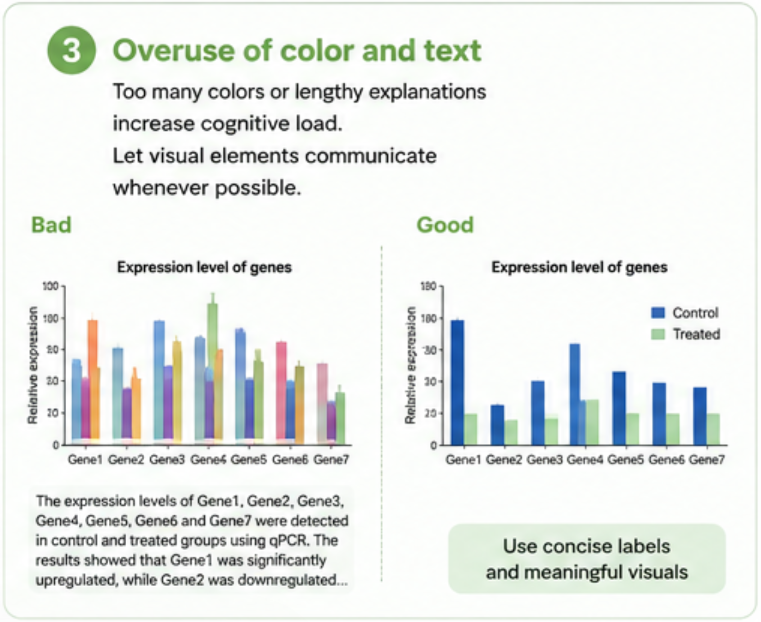
Color is one of the most powerful tools in scientific figure design.
It can distinguish different biological components, highlight experimental groups, indicate changes, or show different stages of a process.
But color can also become a source of confusion.
Using too many colors can make a figure visually noisy. Even worse, changing the meaning of a color from one panel to another forces readers to repeatedly reinterpret the visual language.
A good scientific color palette should support the information rather than simply make the figure more attractive.
For example:
🧬 Different colors can represent different biological components
🔴 One color can distinguish experimental and control groups
🔵 Different tones can represent stages of a mechanism
🟢 A highlight color can emphasize an important change or outcome
The exact colors are less important than consistency and meaning.
If blue represents a specific protein in one part of the figure, readers should not suddenly see blue representing an unrelated molecule elsewhere.
A limited color palette often makes scientific information easier to process.
Instead of using a different color for every object, consider establishing a small visual system:
Primary colors → Major categories
Secondary colors → Supporting elements
Accent color → Key findings
This makes the figure more coherent and reduces unnecessary visual competition.
Color choices should also consider accessibility. Strong contrast and distinguishable colors can make figures easier to interpret for a wider audience, including readers with color-vision deficiencies.
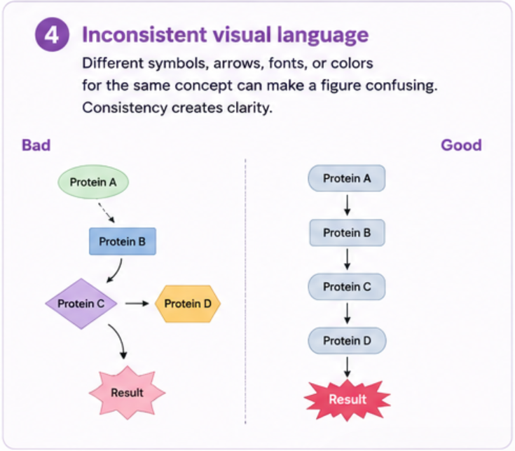
Imagine a figure in which:
One protein is illustrated as a sphere in one panel and a flat icon in another
Arrows have different meanings but look identical
Fonts change between sections
Similar molecules are represented using completely different styles
Labels use inconsistent sizes and spacing
None of these problems may make the science technically incorrect.
But together, they create visual friction.
Scientific visualization works best when readers do not have to constantly learn a new visual language.
If the same object represents the same scientific concept, its appearance should remain consistent.
For example:
Protein A → always the same shape and color
Cell membrane → consistent structure
Activation → consistent arrow style
Inhibition → consistent inhibitory symbol
Experimental group → consistent visual treatment
This allows readers to focus their mental effort on understanding the science rather than decoding the design.
A strong scientific figure should have its own visual grammar.
This includes:
Consistent typography
Consistent iconography
Consistent arrow systems
Consistent molecular representation
Consistent line weights
Consistent spacing
Consistent labeling conventions
When these elements work together, the figure feels like one coherent system rather than a collection of separate graphics.
This principle becomes especially important when several figures appear within the same research paper or presentation.
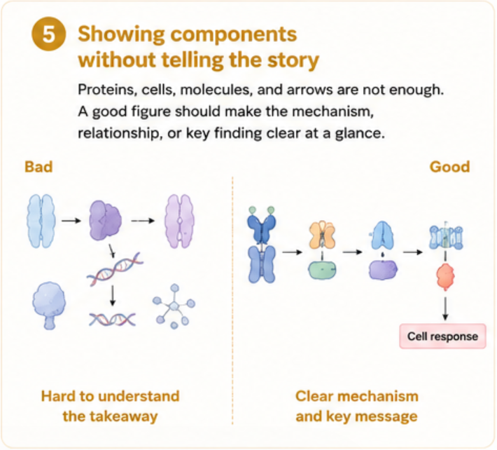
Perhaps the most important problem is also the easiest to overlook.
A scientific illustration can contain proteins, cells, molecules, pathways, arrows, receptors, tissues, and experimental conditions—and still leave the reader asking:
“So what is actually happening?”
Showing components is not the same as explaining a mechanism.
The purpose of scientific illustration is not simply to reproduce scientific objects.
It is to make relationships visible.
For example, instead of simply showing:
Protein → Cell → Molecule → Tissue
an effective illustration should help the reader understand:
What interacts with what?
What changes?
What causes the change?
What happens next?
Why does the process matter?
This is the difference between displaying information and communicating scientific insight.
A strong scientific figure should make relationships, processes, mechanisms, or outcomes easier to see.
It is important to emphasize that visual communication does not replace scientific accuracy.
Scientific accuracy is fundamental.
However, accuracy alone does not guarantee comprehension.
A useful scientific figure needs to balance several dimensions:
| Principle | Key Question |
|---|---|
| Accuracy | Is the scientific information correct? |
| Clarity | Can the reader understand the information quickly? |
| Hierarchy | Is it obvious what matters most? |
| Consistency | Does the visual language remain stable? |
| Storytelling | Does the figure explain the scientific message? |
| Accessibility | Can different readers interpret it effectively? |
When these principles work together, a scientific figure becomes more than an illustration.
It becomes a communication tool.
Scientific research is becoming increasingly complex.
New discoveries often involve multiple disciplines, from molecular biology and materials science to artificial intelligence, nanotechnology, medicine, and engineering.
As the complexity of research increases, the ability to communicate that research clearly becomes even more important.
A well-designed scientific figure can help researchers:
Communicate findings more efficiently
Make complex mechanisms easier to understand
Improve the readability of research papers
Strengthen graphical abstracts
Create more effective presentations and posters
Present research to interdisciplinary audiences
Capture attention in scientific publications
At Sondii, we believe scientific illustration is not simply about making research look better.
It is about transforming complex scientific information into a visual structure that researchers, reviewers, and readers can understand more efficiently.
From molecular mechanisms and biological pathways to scientific figures, graphical abstracts, and journal covers, our team combines scientific understanding with visual design to help researchers communicate their work more clearly.
Because when the science is complex, the visual communication should make it easier—not harder—to understand.
A scientifically accurate figure is only the starting point.
The real goal is to help the reader see the message, relationship, mechanism, and insight behind the data.
The best scientific figures do not simply show more information.
They help readers understand the right information at the right time.
And that is what effective scientific visualization is ultimately about.
Anhui Province Academy of Science and Technology, No. 128,Wanshui Road, Hi-Tech Zone, Hefei City, Anhui Province, China
 +86 17354022649
 service@sondii.com


営業時間
11/21 月曜日 - 11/23 水: 午前 9 時 - 午後 8 時
11/24木: 休業 - 感謝祭おめでとうございます!
11/25(金): 午前8時~午後10時
11/26 土 - 11/27 日: 午前 10 時 - 午後 9 時
(すべての時間は東部時間です)
 IPv6 サポートされているネットワーク